The previous Currys checkout was difficult to use, slow, and had high drop-off rates at various stages. Form fields were hard to fill in and the experience was not optimised for mobile devices.
Checkout Redesign
Overview
My role
To create a new checkout experience that reduces friction, drop-offs, and allows customers to quickly add information to complete the order on all breakpoints.
Result
I created a single-page checkout where all customer data is added on one page. This increased progression to the checkout by 1.88%, resulting in an additional £10m YOY.
Research
During discovery, I collaborated with BAs and Solution Architects to map all systems and touchpoints connected to checkout, ensuring nothing was missed. I analysed competitors and identified opportunities to improve speed through pre-filled customer data. Using analytics, I pinpointed where customers dropped off in the funnel to understand key pain points.
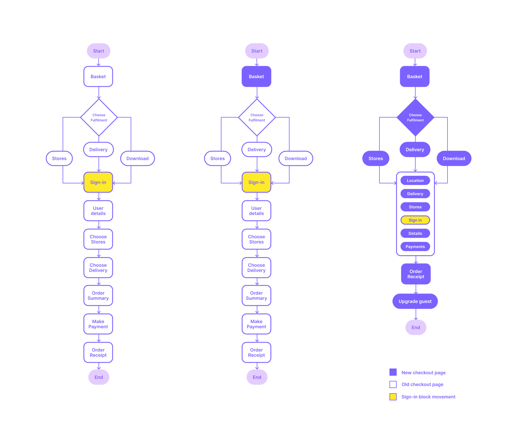
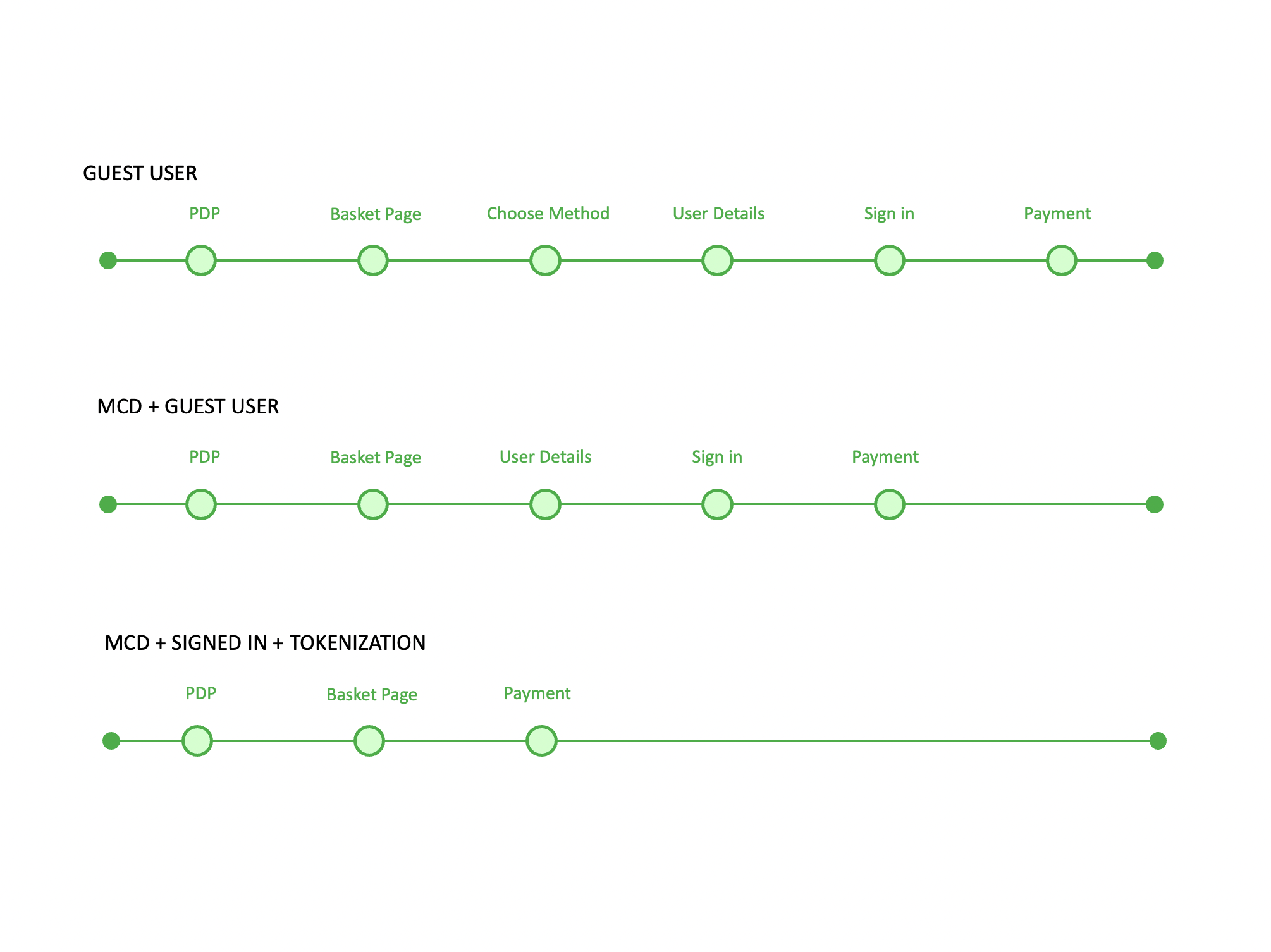
One of the fundamental design changes I made was restructuring the checkout flow, moving sign-in later in the journey as prompting sign-in too early was causing checkout abandonment.
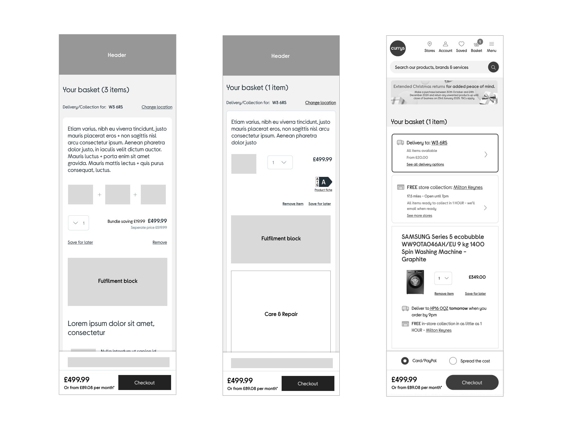
Basket redesign
To redesign the checkout, both the old and new systems needed to run in parallel. I began by redesigning the basket page, ensuring it connected seamlessly to the existing checkout.
Page goals and reducing clicks
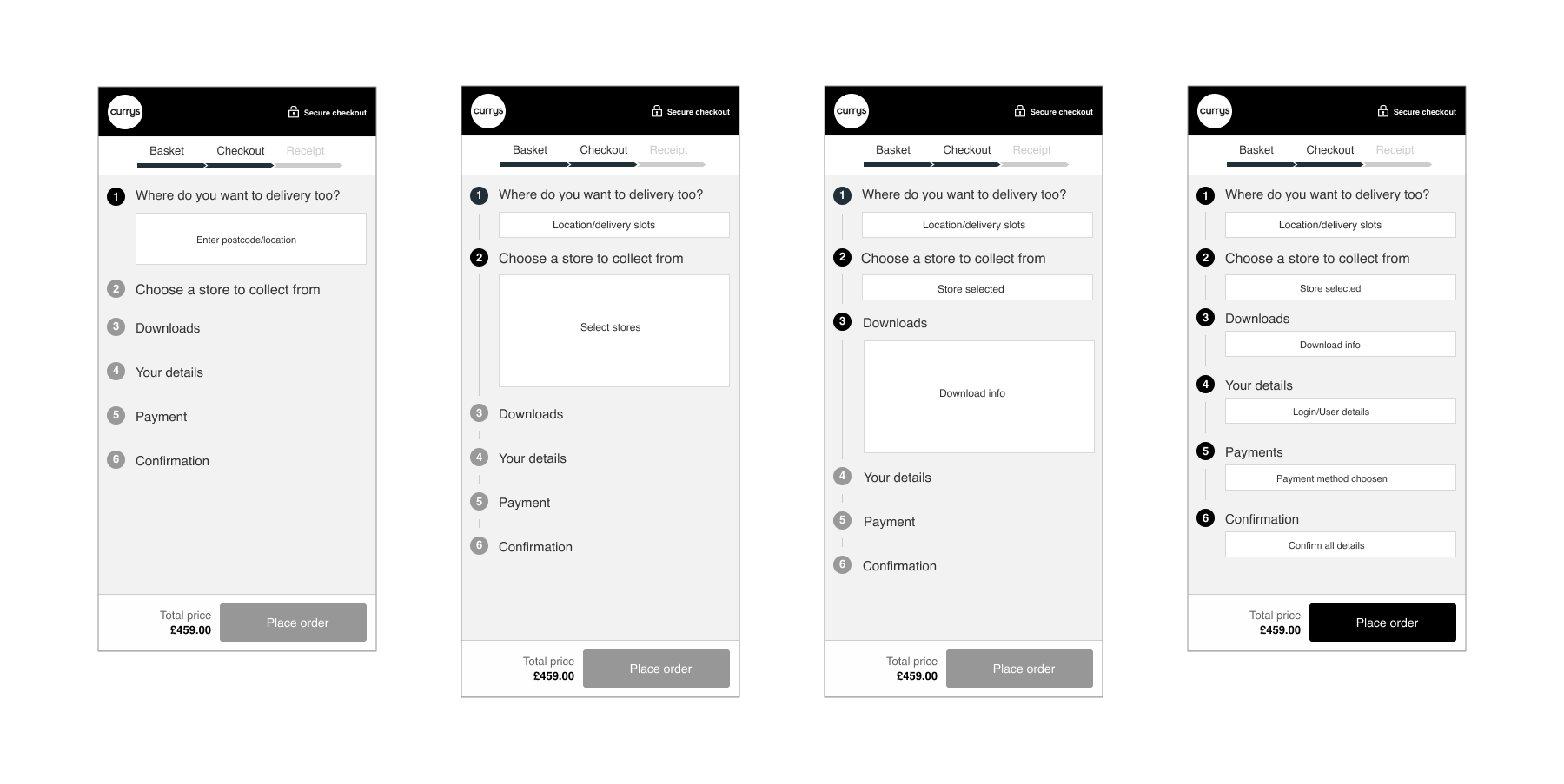
I created a checkout goals page to show stakeholders where each feature would sit on which page. The step journey on the right shows the more data I can save about the customer, the more quicker a customer can complete the order.
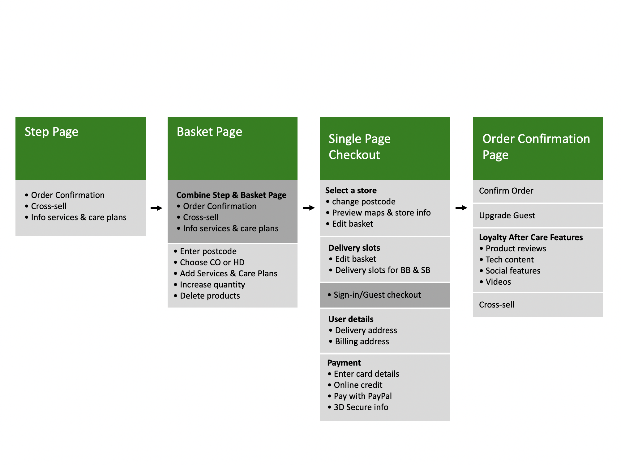
Checkout steps
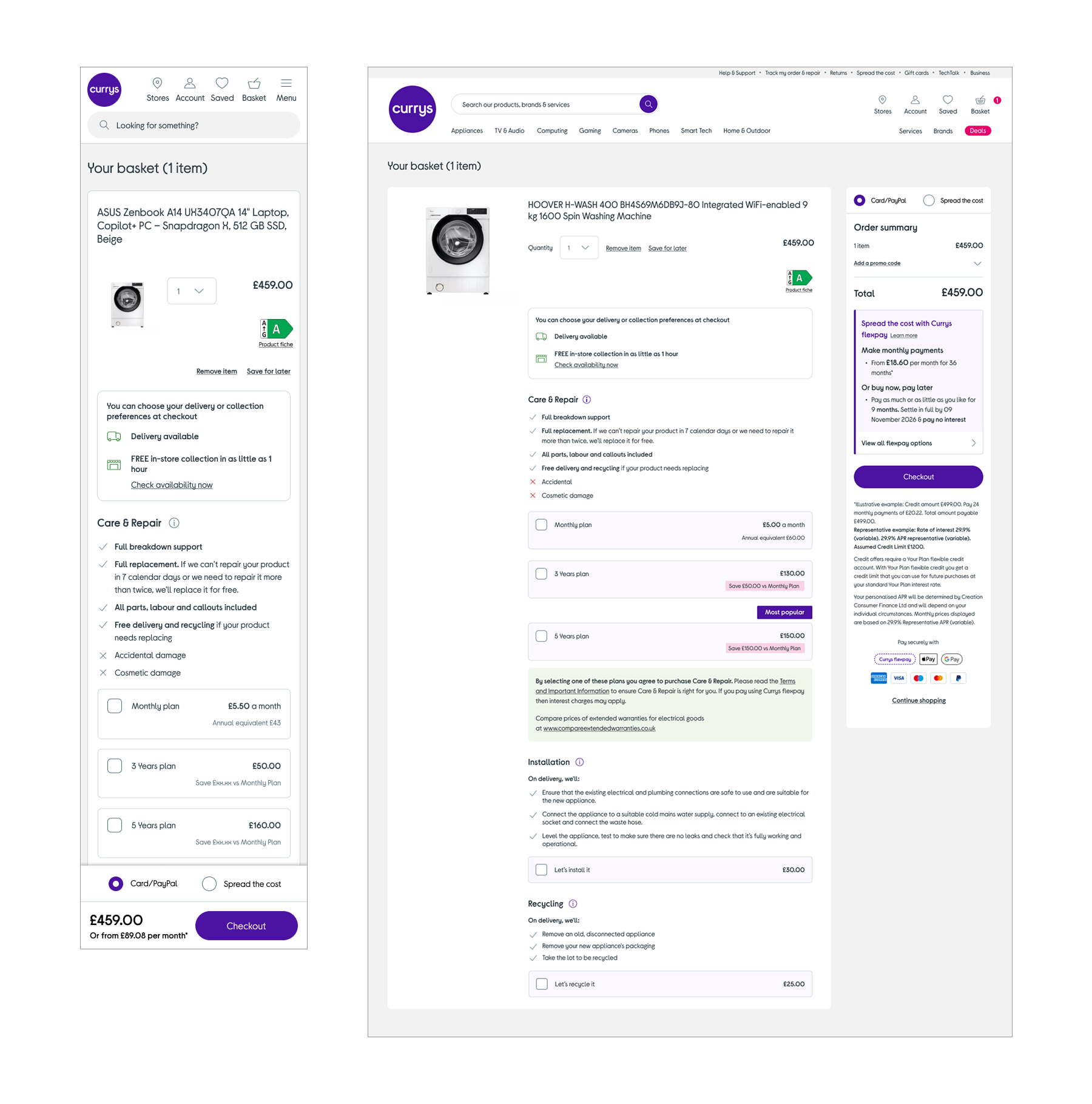
Currys has a complex product types in order to make sure new checkout worked for all product types, I created wireframes for the worse case scenario, if the design worked for that scenario it will work single journeys, this wireframe shows how my design works for a worse case mix basket scenario without breaking the checkout.
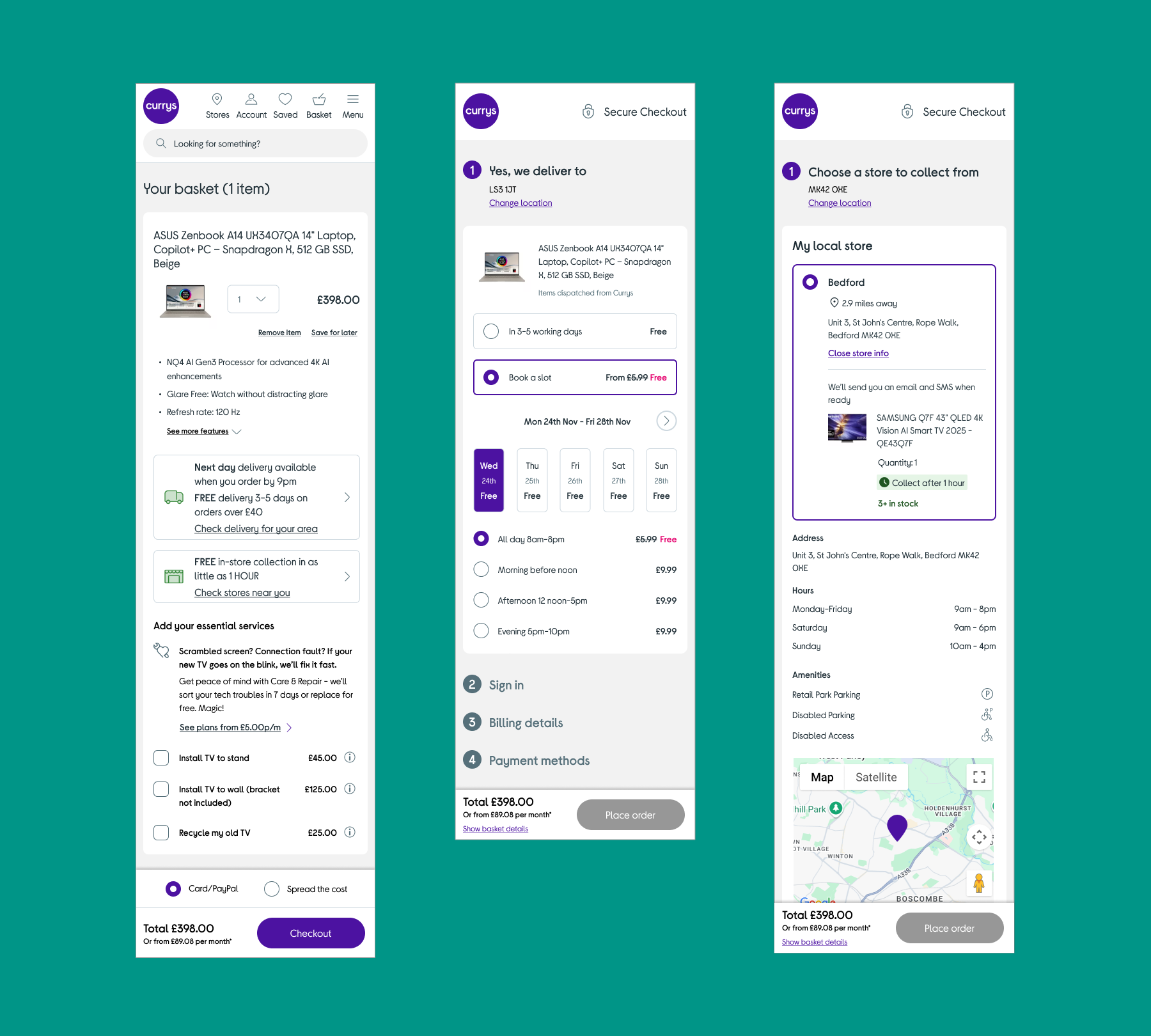
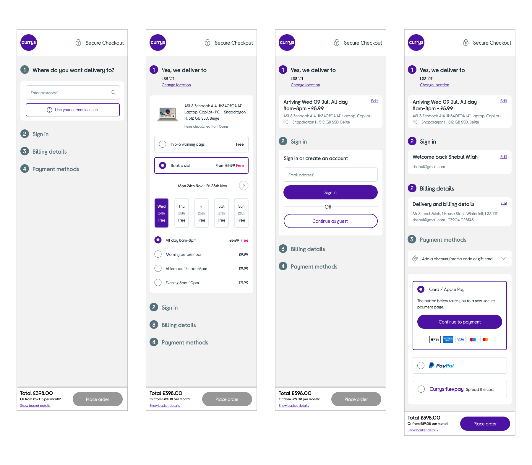
Final Delivery UI Design
The final UI design allows choosing delivery slots or store collection without signing in. As users complete each section, it collapses, giving a perception of speed. This design suits both single orders and mixed baskets.
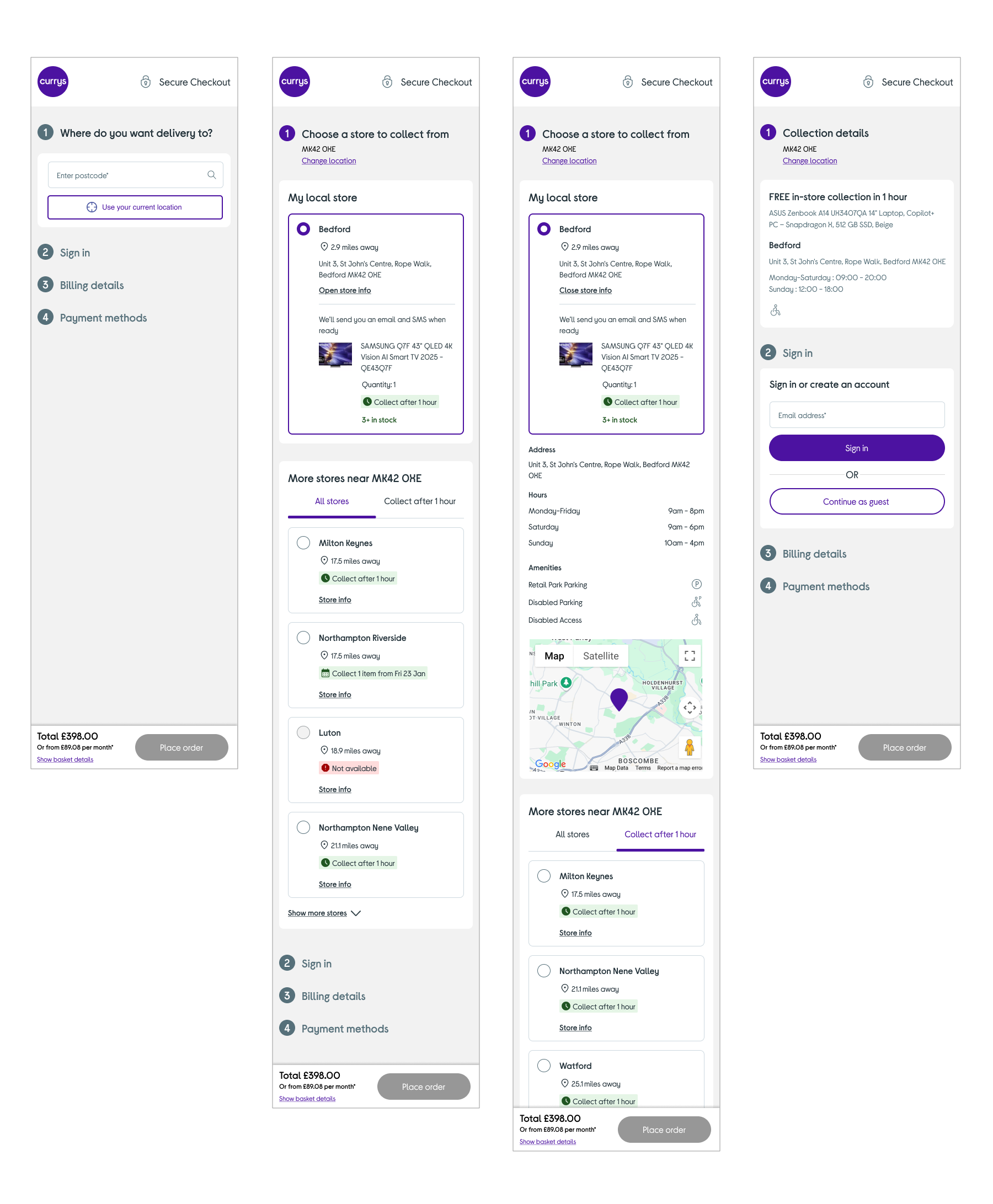
Final Collection UI Design
I had designed the collection journey as part of the single page checkout but a few years later I returned back to a different squad to redesign the collection journey as it was getting negative NPS scores, in this user research document you can see the steps I took to make collection easy.
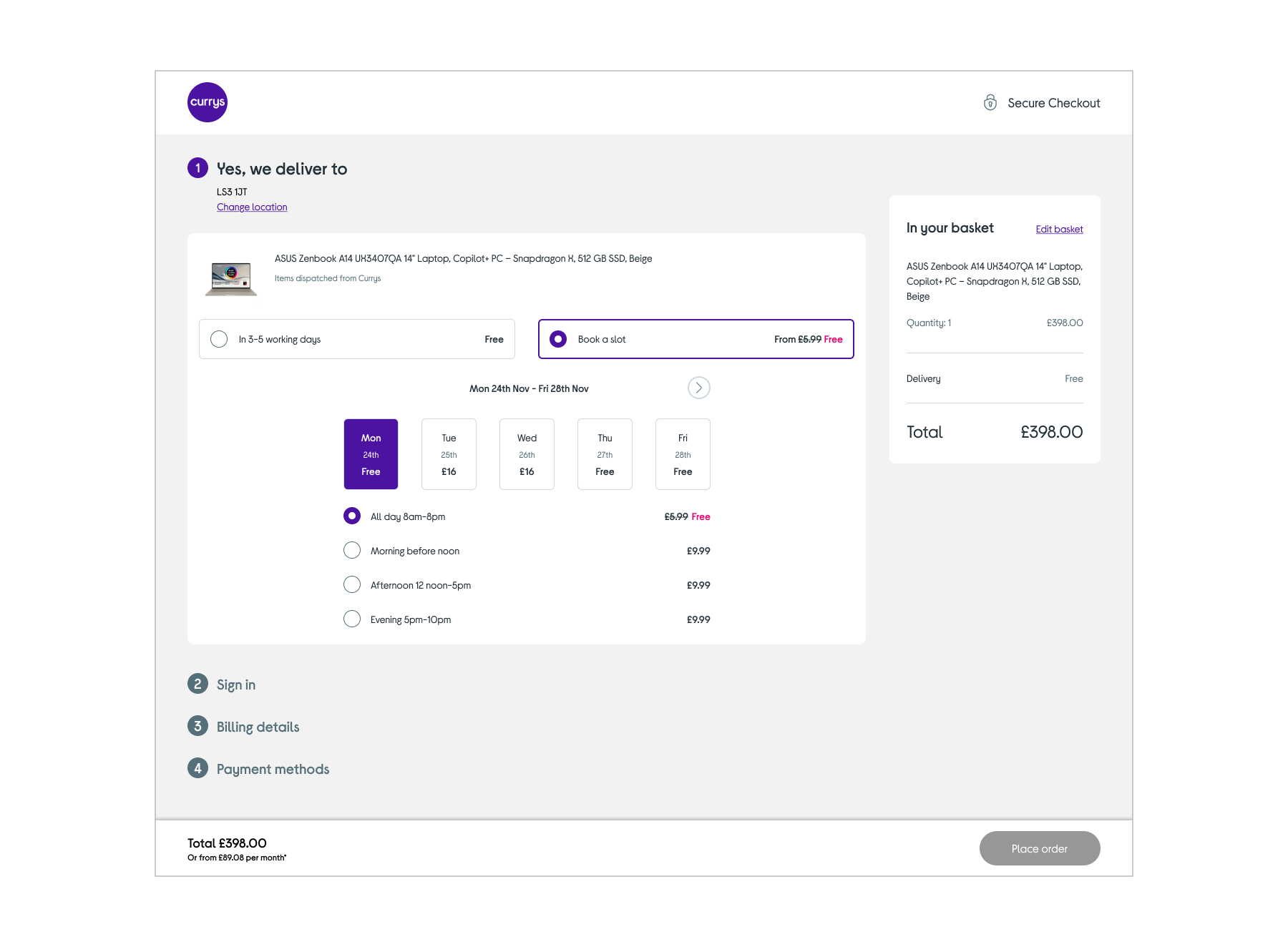
Desktop Delivery Slots
This is an example of a desktop page showing delivery slots, you can see how the layout is design agnositic and can work for a mix basket scenario.
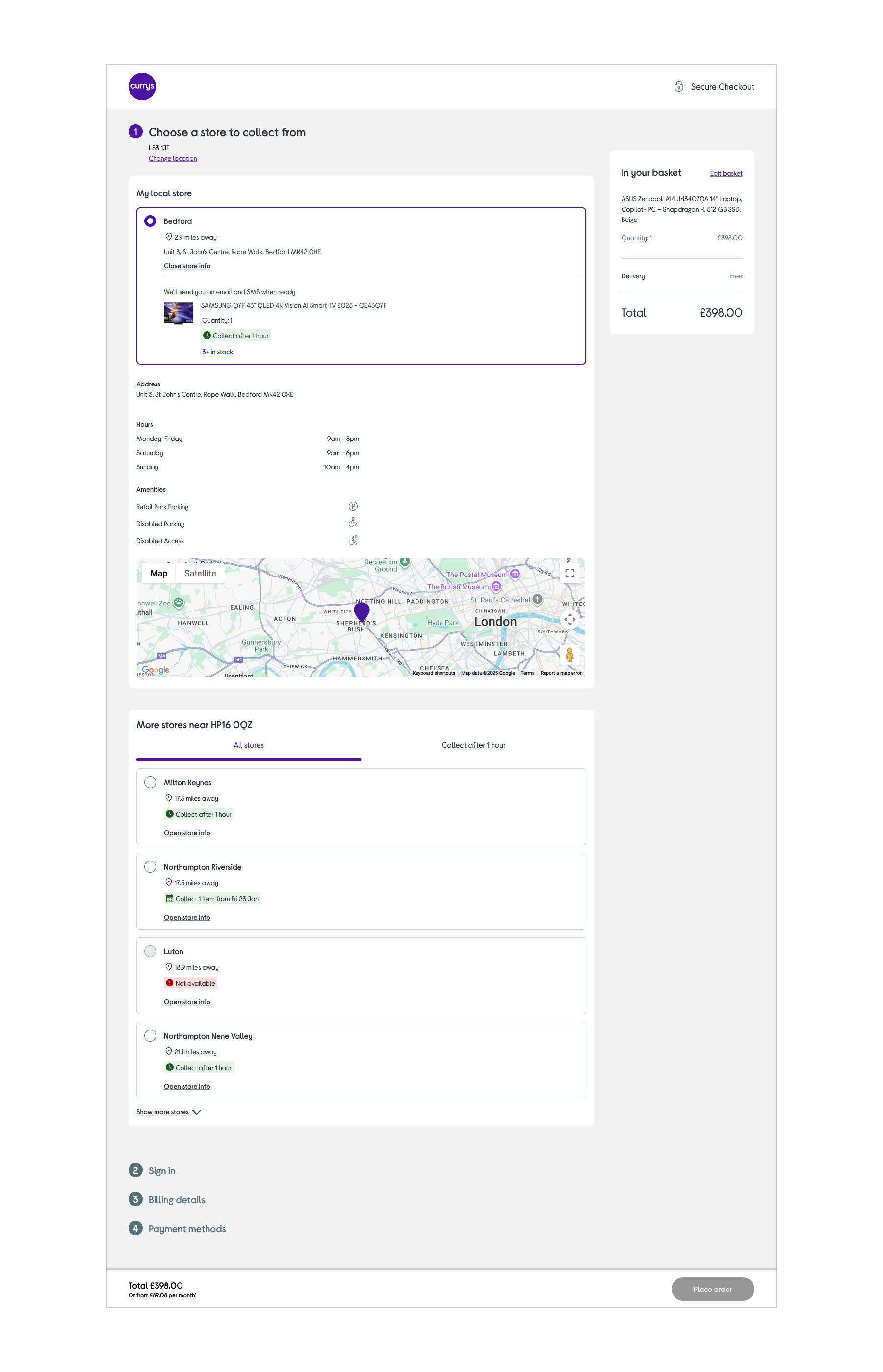
Desktop Collection
This is an example of a desktop page shows how a customer has chosen their selected stored but can toggle between stores within 1hr or see all stores.
Result
By conducting extensive research, testing, designing, and prototyping, I mapped out the entire single-page checkout experience and launched it incrementally.
1%
Checkout progression
The single-page checkout increased progression by 1.88%, indicating fewer drop-offs and more completed orders.
£0m
Checkout revenue
A 1.88% increase in revenue translated to an additional £10m YOY, thanks to reduced friction and barriers.
0%
Small items mobile conversion
Redesigning the delivery slots and store selection optimised the mobile site, improving mobile orders.
0%
Large items mobile conversion
Optimising the mobile experience for large products increased mobile conversion to 5%.
0.0%
Basket insurance increase
An A/B test of the basket insurance options highlighted the benefits of each option, increasing conversion by 4.2% and generating £1.3m YOY.